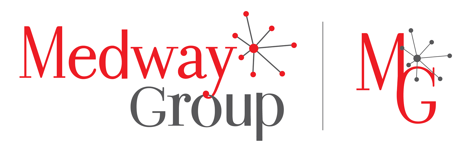
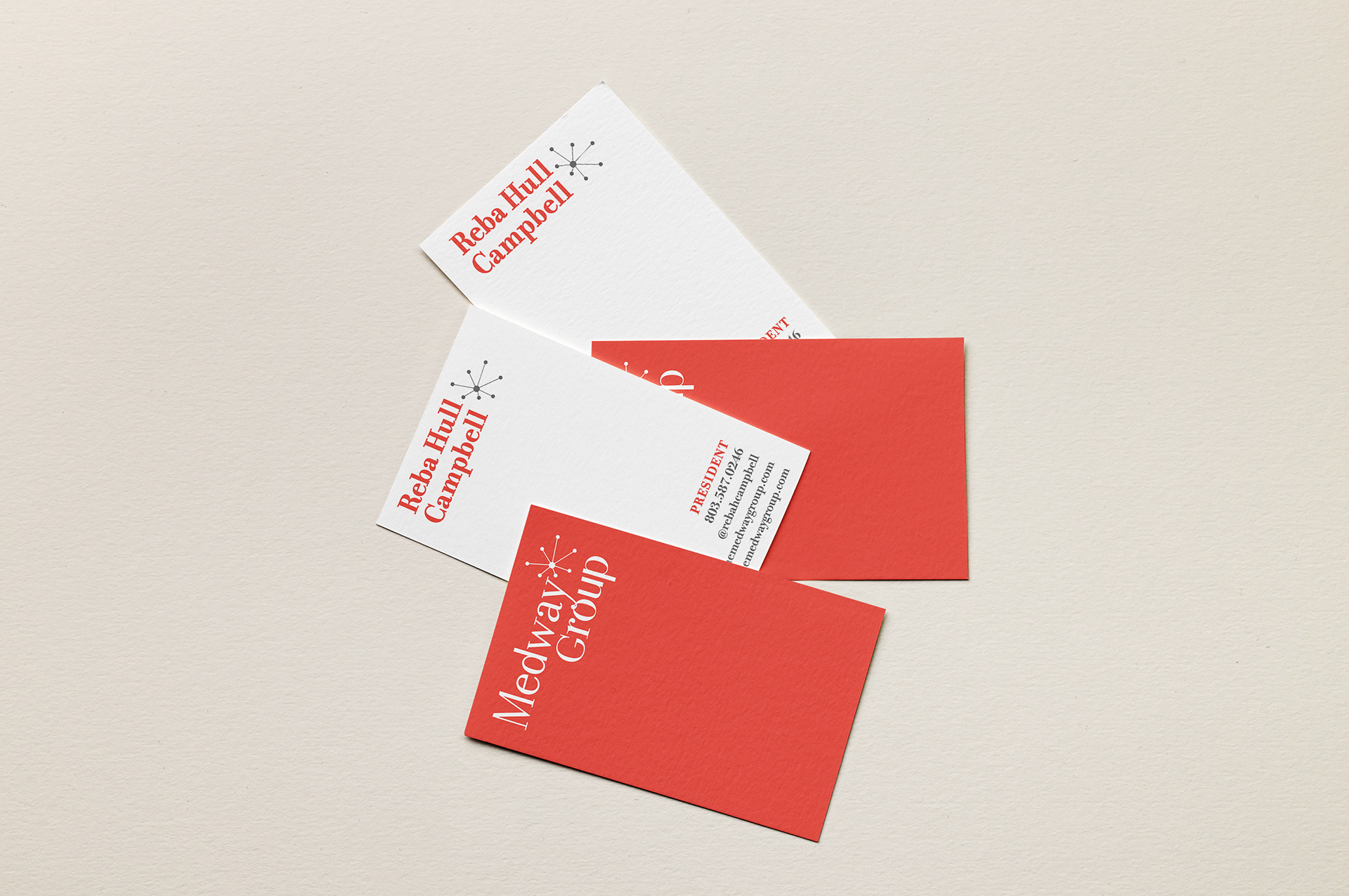
The Medway Group
The Medway Group is a consulting firm in Columbia, SC. I completed the brand identity system based on the idea of connecting people and ideas and designed the website.

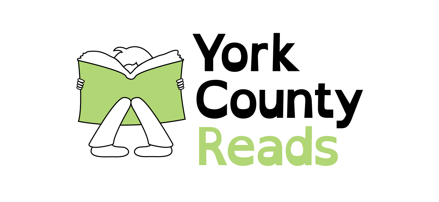
York County Reads
York County Reads is a nonprofit that seeks to help children with dyslexia improve their reading skills with no to low cost literary instruction. I created their logo with child-like imagery and designed the text based on a typeface that was originally created to be easier to read by those with dyslexia.
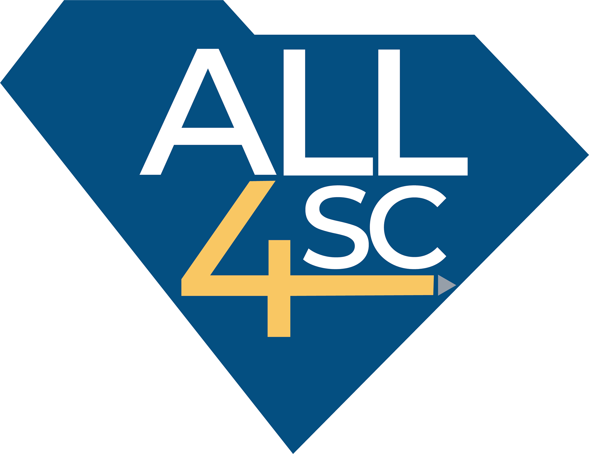
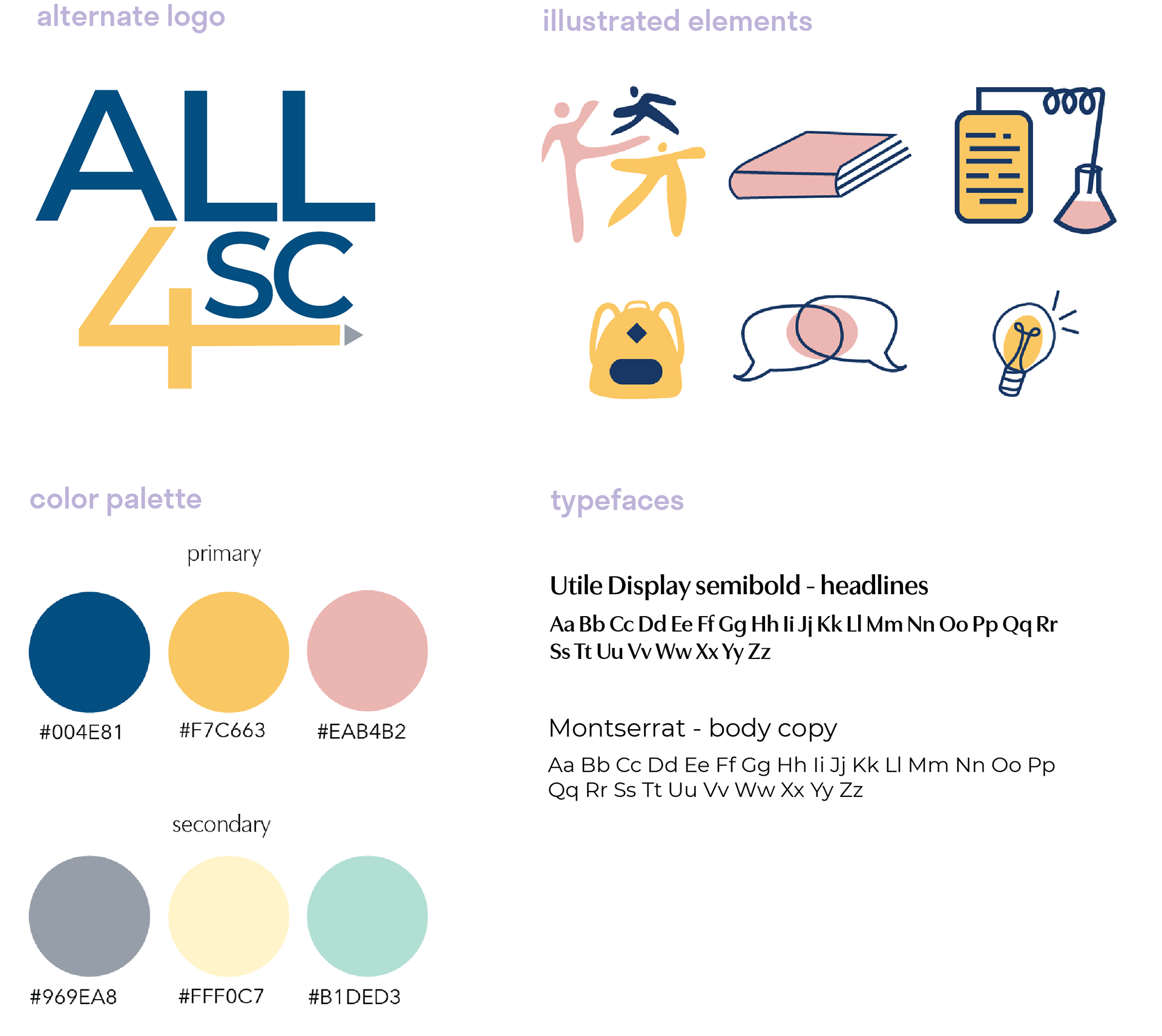
ALL4SC
I re-designed the logo and branding for ALL4SC, an excellence initiative sponsored by UofSC to improve education statewide. I wanted to keep their original element of the South Carolina outline, but made it the blue color of the state flag. The four was stylized as a pencil to represent education and give it a fun element with the geometric type, with the pencil point representing moving forward to improve education. It was made to be sophisticated, easy to interpret, and able to be used at any size.
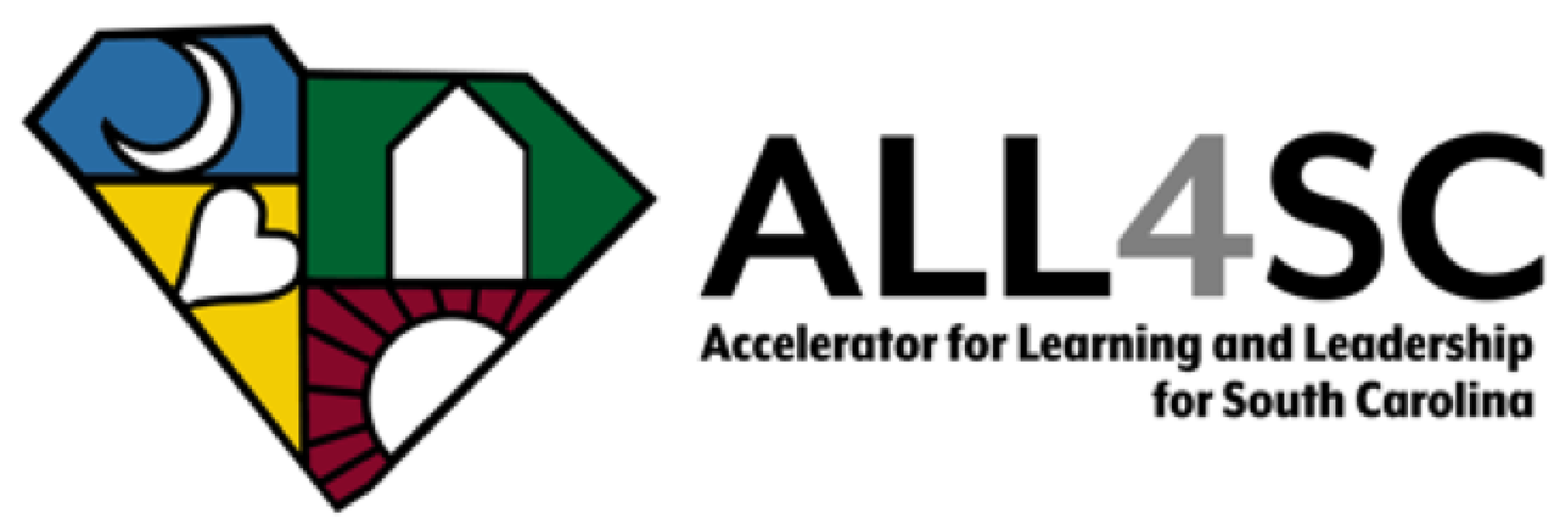
Original logo provided.
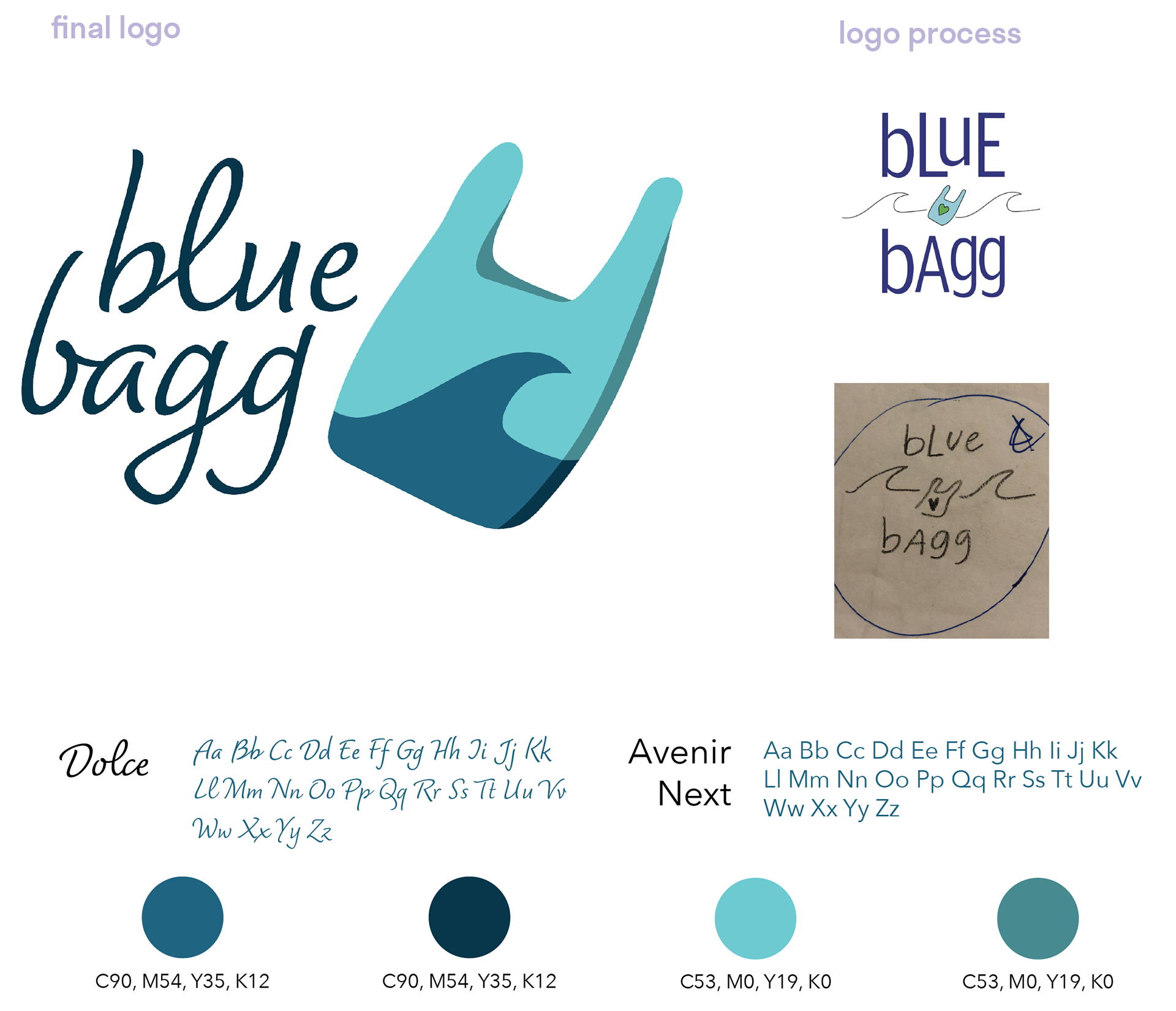
blue bagg
blue bagg, a company that creates bags by cleaning up the ocean, needed a creative brand to advertise its business. Its target audience is female millennials who are environmentally aware. The company wanted aquas and blues as the colors, with a youthful, feminine, playful style. The logo is comprised of a word mark and an icon, to be used together or separately.
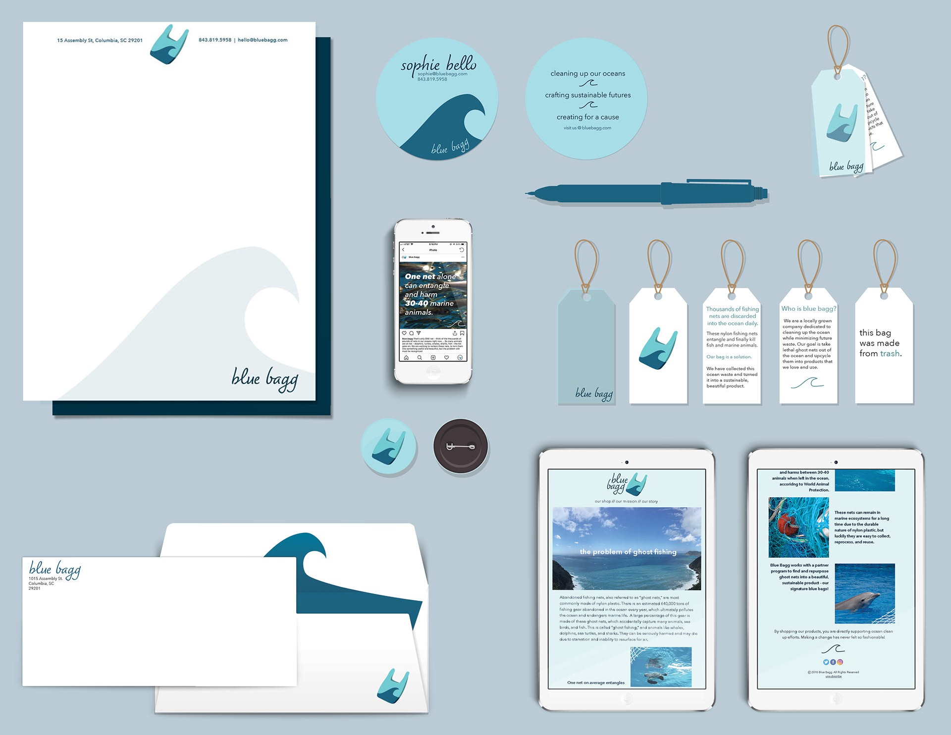
The complete identity system includes a letterhead and envelope, a circular business card, a digital newsletter, and an example hang tag that would be attached to the physical product, providing information about how and why the bag was made.
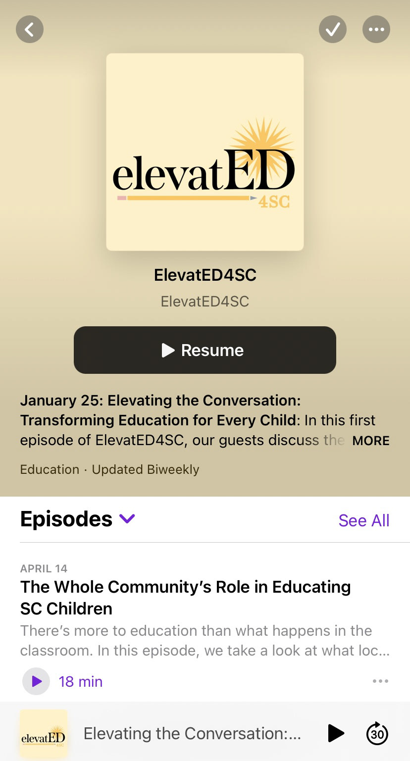
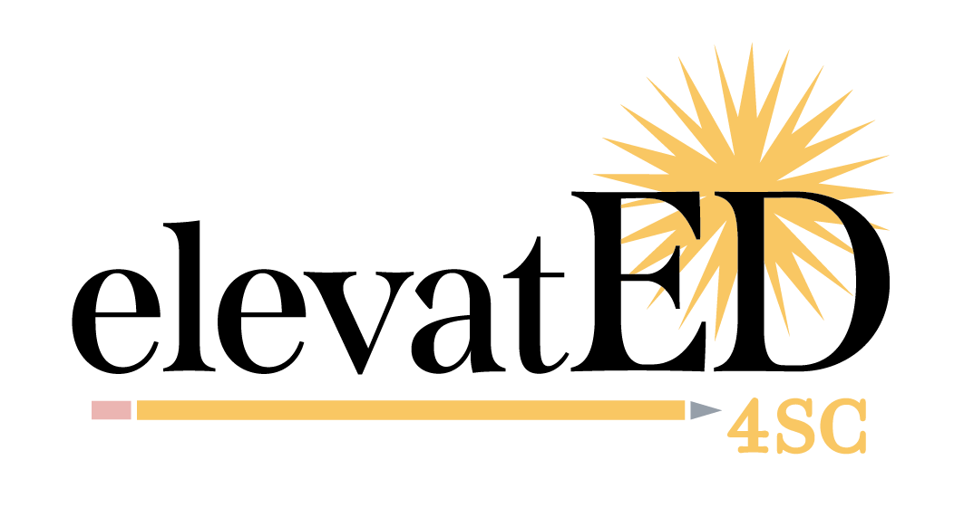
ElevatED4SC
ElevatED4SC is a video podcast created by ALL4SC, sharing stories of education across the state of South Carolina. I chose to use symbols in the logo, such as the pencil element and the shade of yellow, to co-brand with ALL4SC. I wanted the podcast to have its own identity, yet still nod towards the organization creating it. The yellow burst behind the "ED" in the logo represents both a palmetto tree (as a nod to South Carolina) and a symbol of a bright future ahead in education. Along with the role of graphic designer, I am additionally assistant producer for the vodcast.
Primary Logo